Finn by Chase (RIP 💀)
I led UX copywriting and content strategy for Finn by Chase, a mobile app that aimed to put a friendly face on finances by balancing emerging technology and a more casual voice than traditional banking experiences. I guided content strategy from a holistic perspective, collaborated with designers, researchers, marketers, and product owners. I also oversaw a team of UX copywriters, provided creative direction to ensure every piece of copy fit the right voice, tone, context, and aligned with the overall strategy.
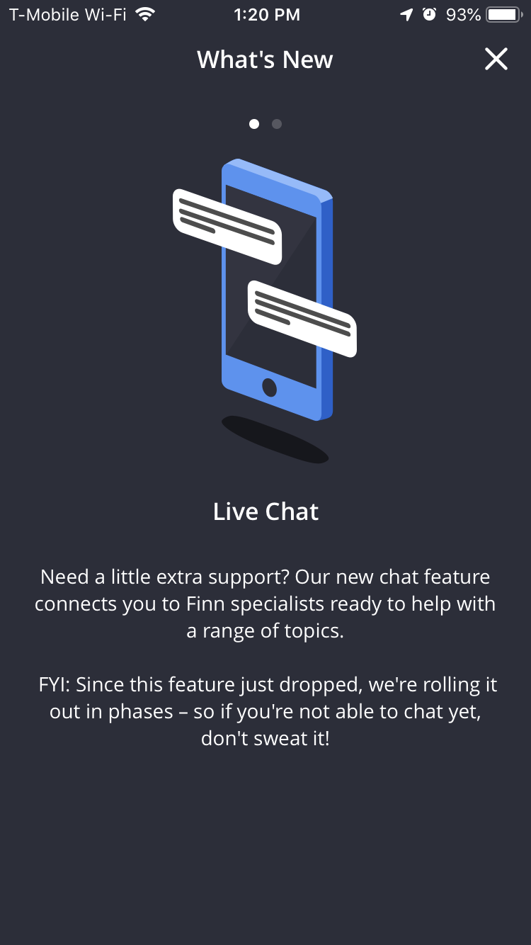
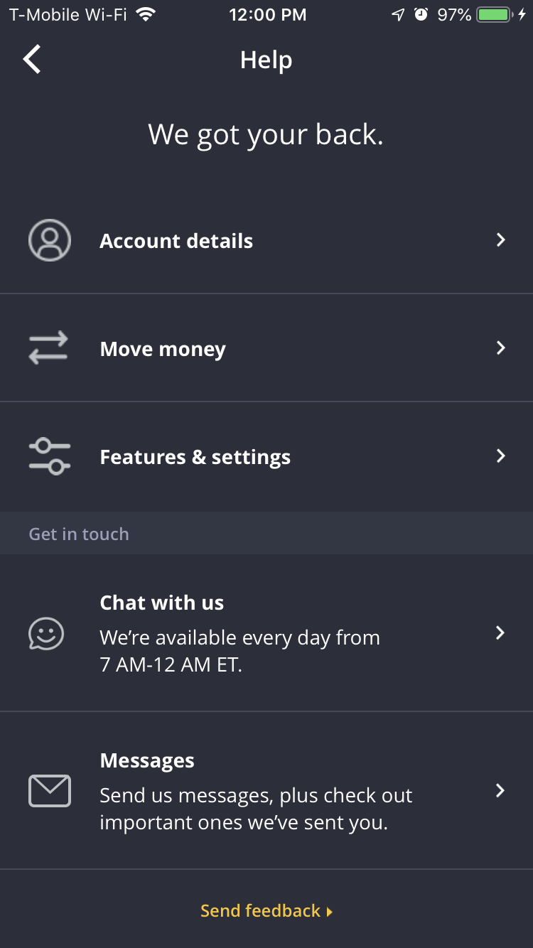
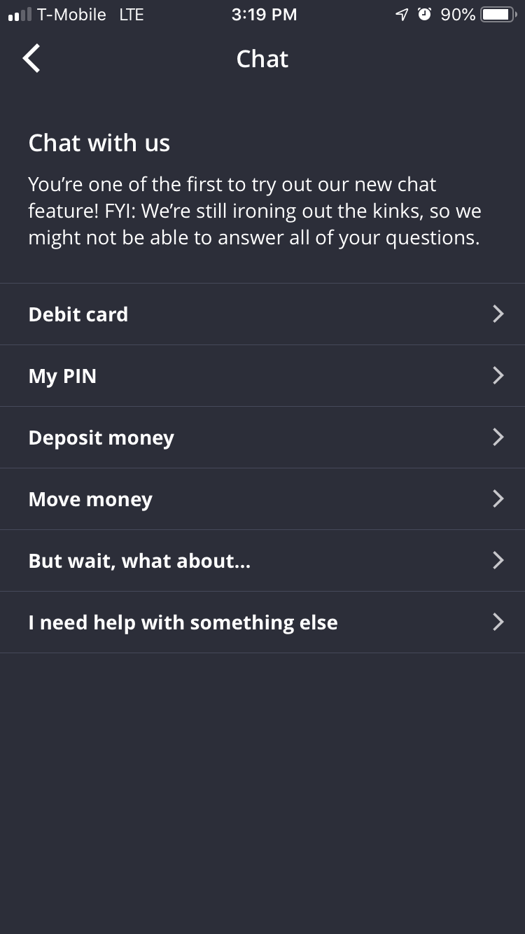
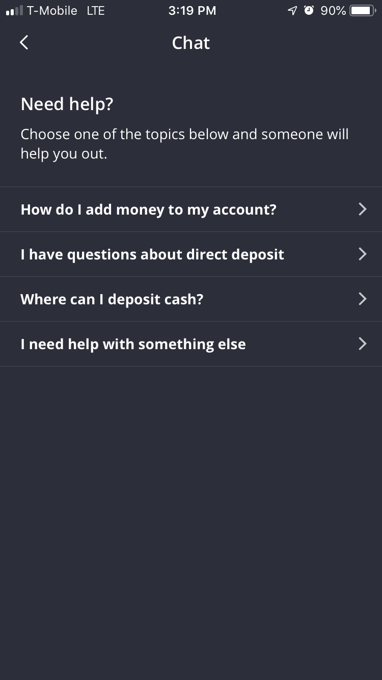
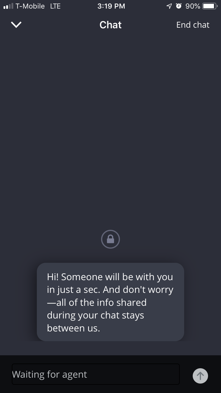
Live Chat
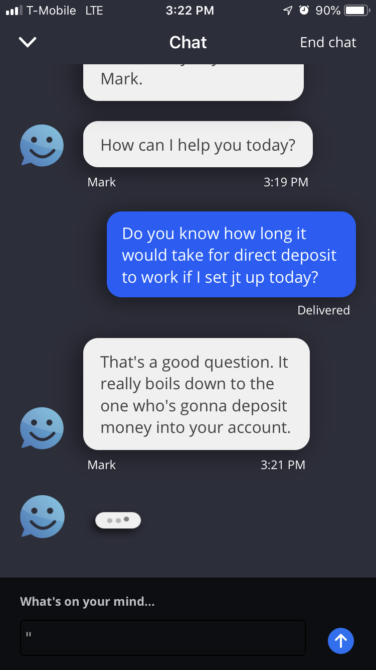
One of the biggest initiatives I helmed while leading Finn was the development and launch of Live Chat. To begin, the team conducted extensive user research based on the hypothesis that modern customers not only would be comfortable chatting to a customer service agent via app, but that they may even prefer chat over other methods (I’m looking at you, 1-800 lines). Once this hypothesis was supported by testing, we began by workshopping the general idea with stakeholders from every vertical — that meant lots of time in a small room with colleagues from all over the bank. From these sessions, an agreement was reached on the initial scope for Live Chat, and the strategizing began.
Teaming up with a crew of UX designers, product owners, and developers, we crafted the initial version of what the functionality would eventually come to life as. My role was not only that of content strategist, but the owner of brand voice — since live chat agents wouldn’t necessarily be familiar with the cadence and tone that Finn customers had come to expect, it was my mission to create guidelines and training materials that would lay out best practices to give the agents a solid verbal foundation for their chats.
What follows is the Live Chat flow, after the initial launch in late 2018. The technology proved itself successful, and is now being integrated in other Chase products. Not only that, but the customer service team dedicated to Live Chat was a hit with customers, receiving overwhelmingly positive feedback for their friendly tone and general helpfulness!
Move Money Screen
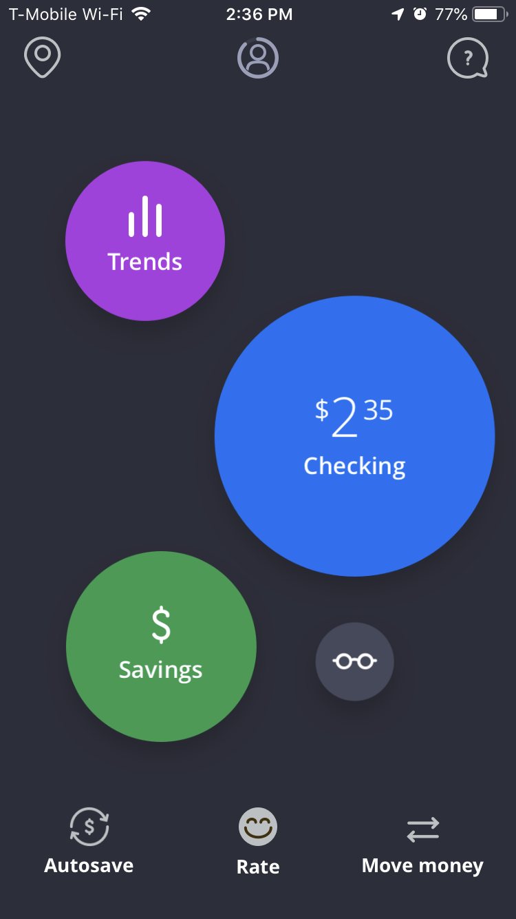
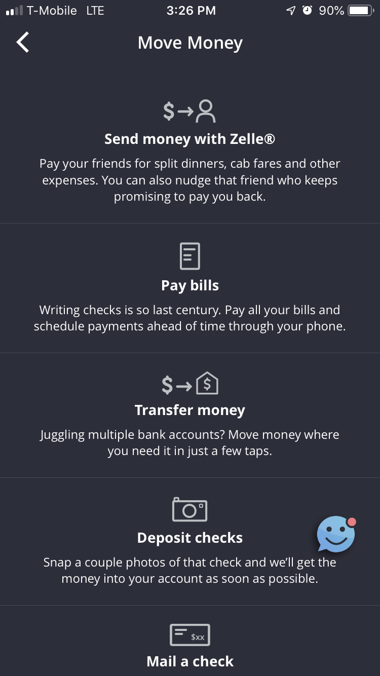
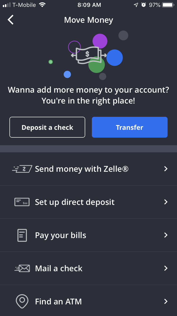
As in all finance products, it’s necessary for a customer to begin using the platform to bank — or the very basis of the product is moot. With Finn, we found that while users would initially fund their account with a debit card or Zelle transfer, the majority wouldn’t continue to add more money after depleting the original balance. In an effort to change this user behavior, we launched the following Move Money screens as an in-app A/B test.
All users would see the same home screen (at left). Once they tapped in to the Move Money flow, one of the two following screens would appear. The screen in the middle was used in the MVP — infused with personality of the copy variety, but perhaps overly complicated. The screen on the right is the version we tested against, hoping to uncover whether the simplicity of the flow would positively impact user behavior (as in, adding more money to their account). Not surprisingly, there was a small but measurable uptick in positive user behavior among the users who were presented with the Move Money screen on the far right. Because of these results, we nixed the middle Move Money screen for good.
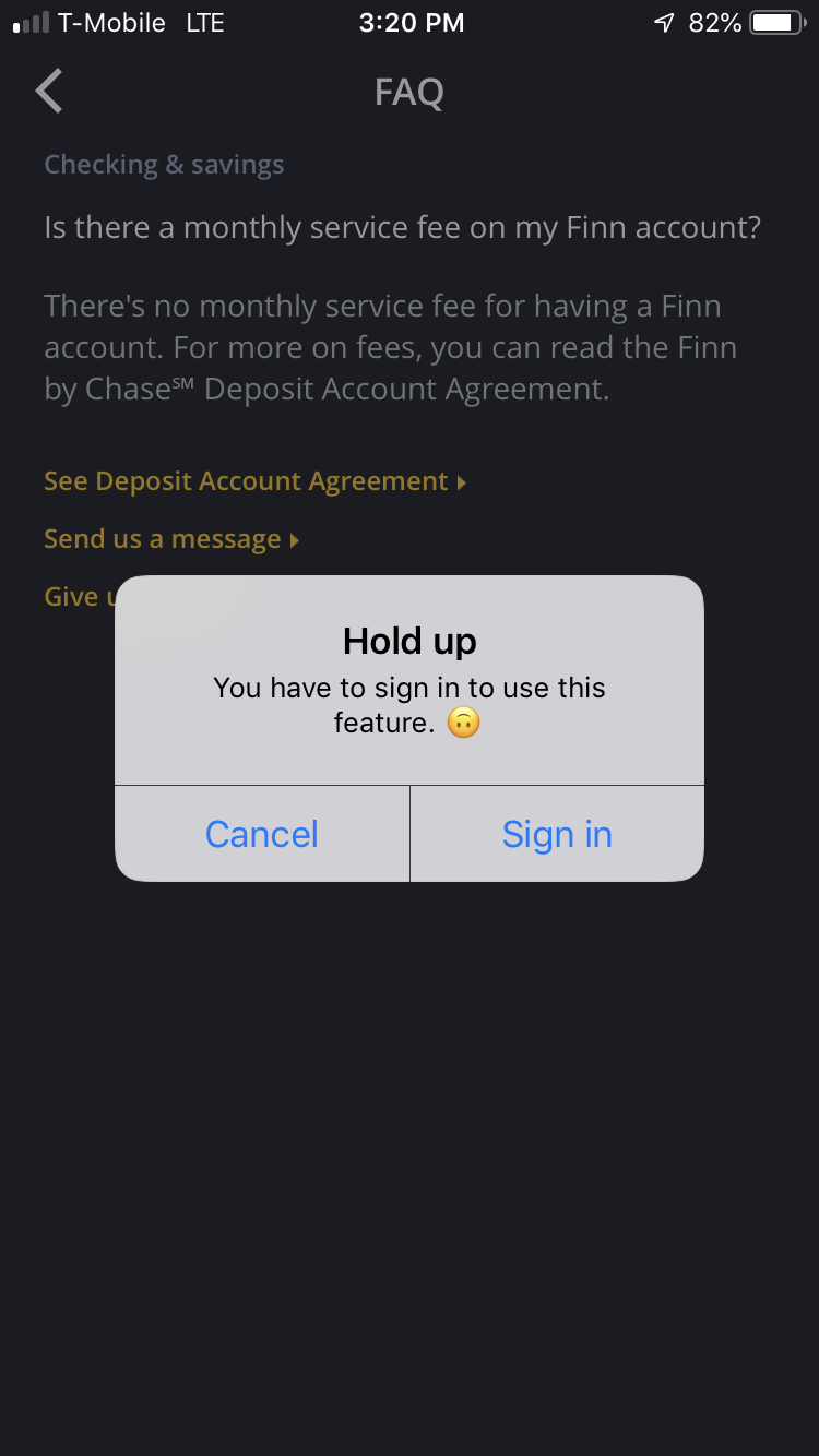
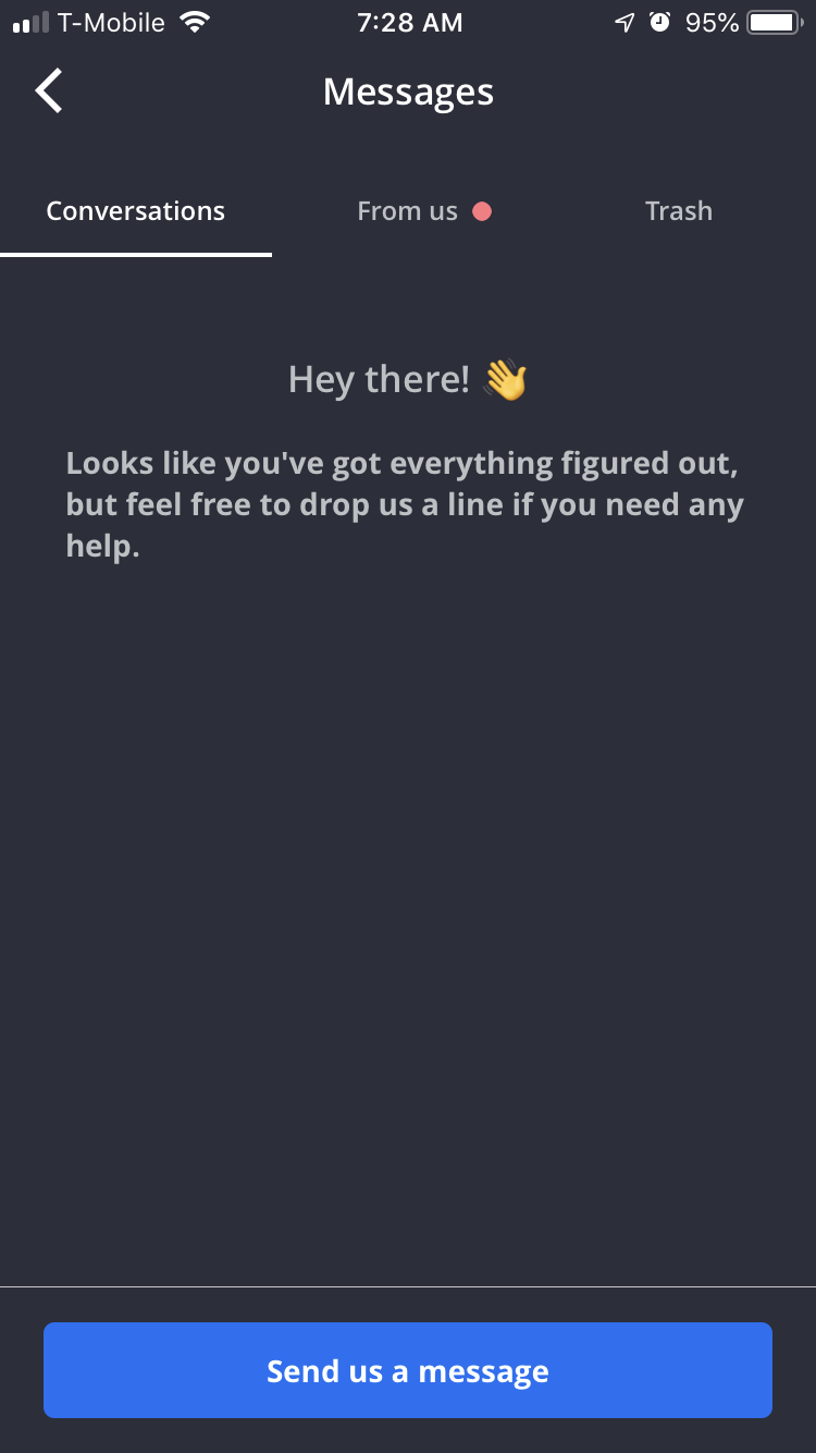
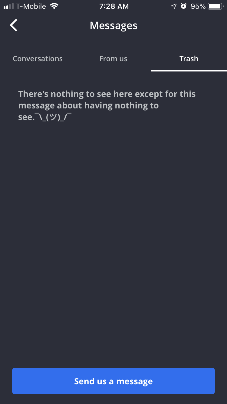
Error Messages and Empty States
Because Finn’s voice is based on a conversational tone, we needed to carry this vibe through to even the simplest screens in the experience — that’s right, error messages and empty states. Here’s a sampling of some of what a Finn customer might experience in-app.
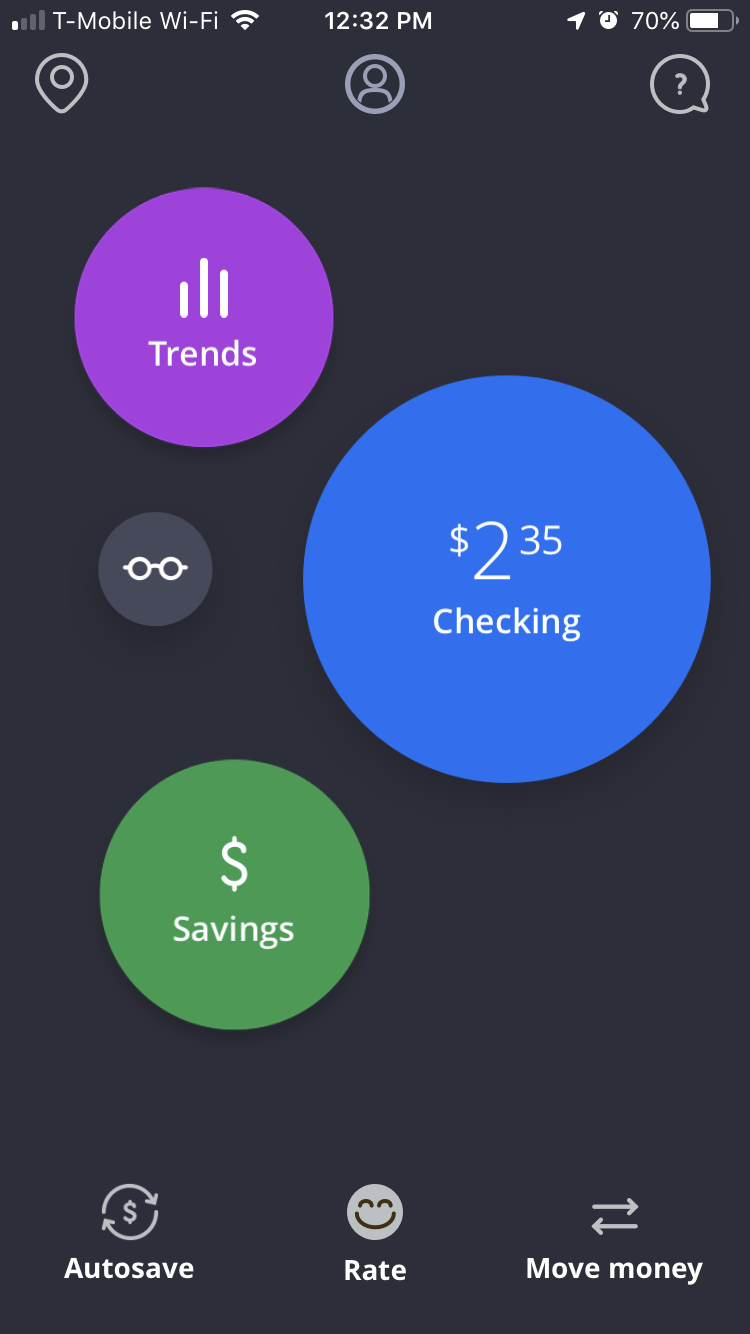
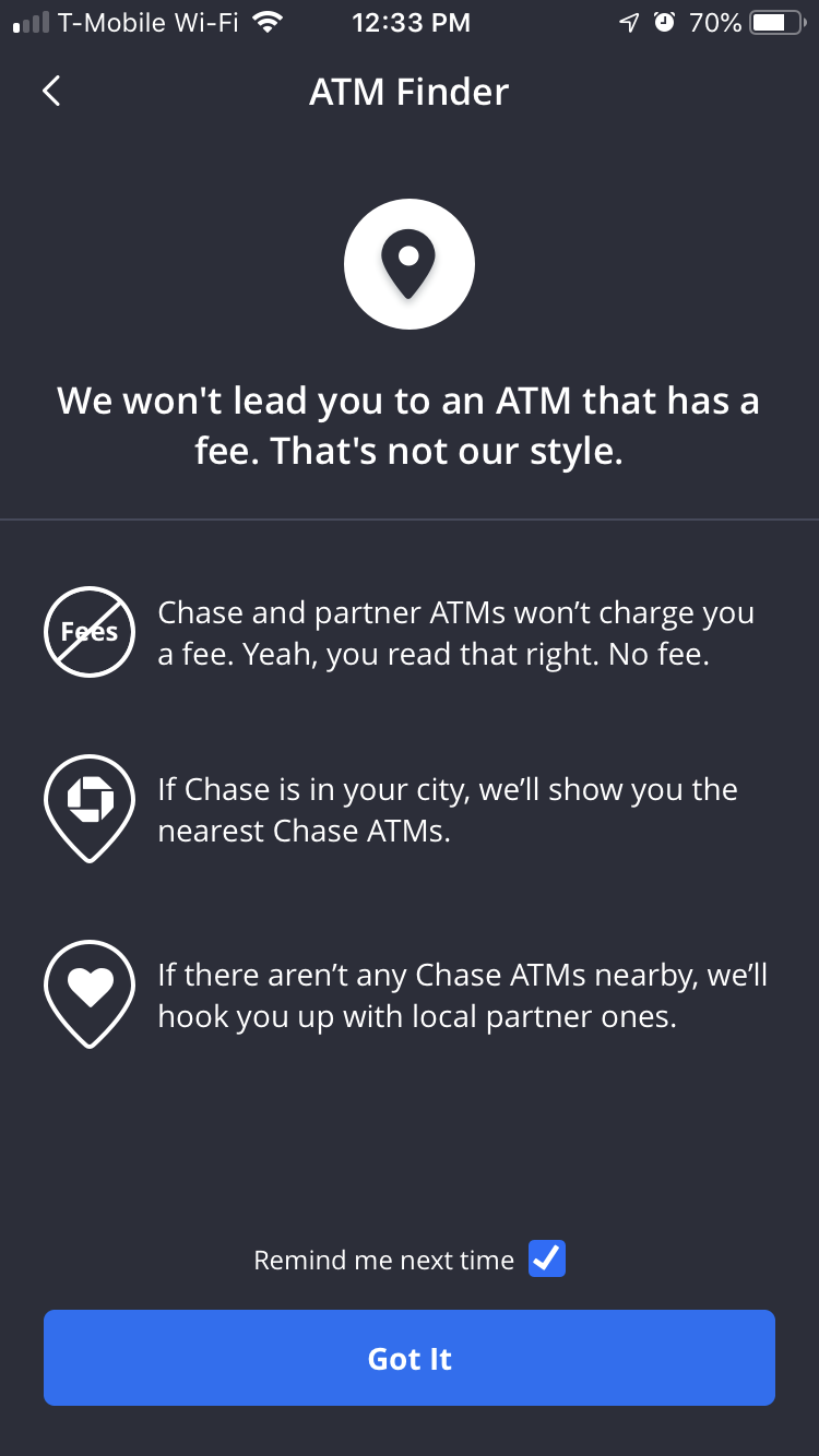
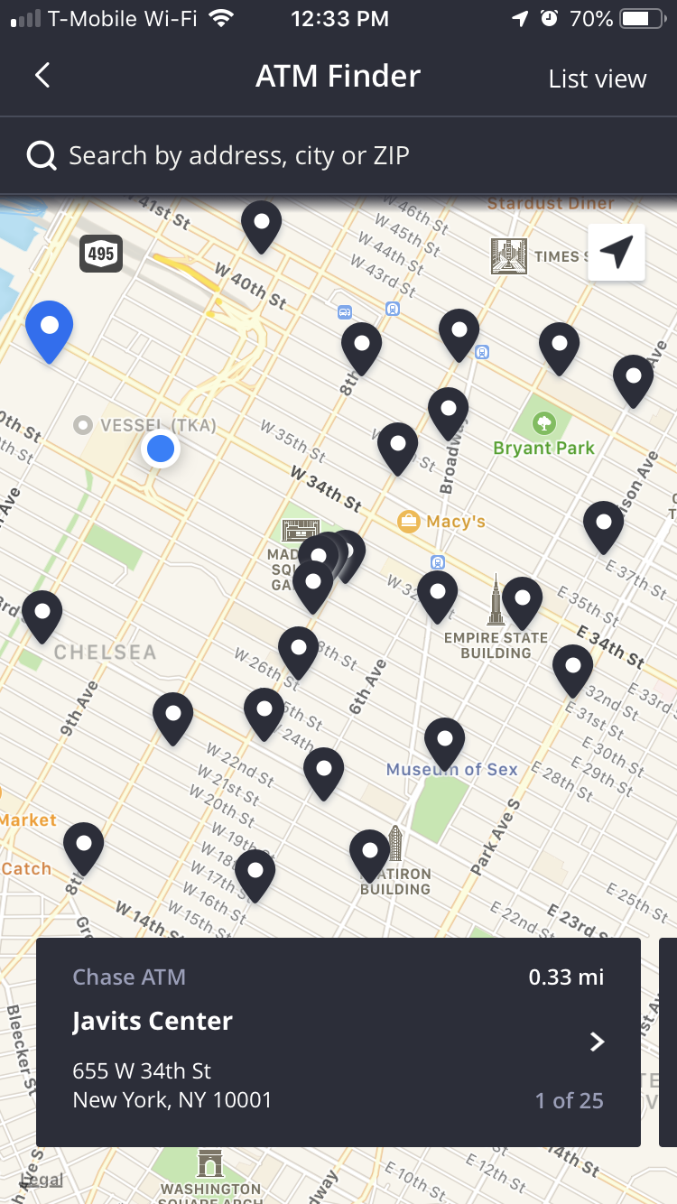
ATM Finder
Since Finn was a totally mobile bank, ATMs become the most tangible connection between the customer and their cash. As such, an easy-to-use ATM finder became a key feature in the app — especially since a number of our users are out-of-footprint for Chase, and would need to rely on our fee-free partner ATMs. The existing tech within Chase was limited, so our team had the opportunity to create a tool that would be truly useful to our customers, wherever they are. The user simply taps the map pin icon on the home screen to access the ATM finder, which then leads to a useful and functional flow. Based on customer interviews and reviews, our team learned that even with a function as simple as this one, there’s always an opportunity to delight our customers through on-brand content and intuitive UX.