Content Design @ MetaMask 🦊
Since May 2022, I’ve helmed the Content Design team at MetaMask, a popular web3 wallet trusted by over 100 million people worldwide. As the first content designer on staff, I’ve done everything from creating internal and external style guides to collaborating on new feature launches.
I touch everything from microcopy to major feature launches, and manage a small team of content designers. This is just a glimpse at what I’ve been able to build with my amazing group of product designers, researchers, product managers, and (of course!) developers.
Friction as a tool: The Secret Recovery Phrase quiz
A strategic content intervention that educated users at the exact moment of risk — preventing scams without restricting autonomy.
Context
The problem:
Phishing attacks targeting Secret Recovery Phrases (SRPs) account for some of the most financially devastating scams in crypto.
Even with strong technical defenses, scammers often convince users to voluntarily reveal their SRP, usually through social engineering.
Why this mattered:
MetaMask users’ assets were at risk
Social engineering bypasses technical protections
Documentation-based warnings weren’t working
The moment before SRP reveal was completely unprotected
My approach
I shaped the strategy around three pillars:
1. Education over restriction
Instead of blocking access, we introduced purposeful friction that helps users pause and think.
2. Moment-of-risk intervention
Generic warnings don’t work.
Education needed to happen exactly when a user attempts to reveal their SRP.
3. Behavioral design
We needed to influence user decision-making by:
Surfacing scam patterns
Reinforcing safe behaviors
Helping users recognize red flags
The challenge
How do we prevent users from sharing their Secret Recovery Phrase with scammers without blocking legitimate use?
Constraints:
SRP must remain accessible
Experience can’t become frustrating
Education had to be effective at scale
Tone needed to be protective but not condescending
Identifying the intervention point
We pinpointed the SRP reveal moment as the critical opportunity to protect users.
Up until this point, users moved frictionlessly through the flow, which meant scammers could walk them right into danger.
The goal became clear:
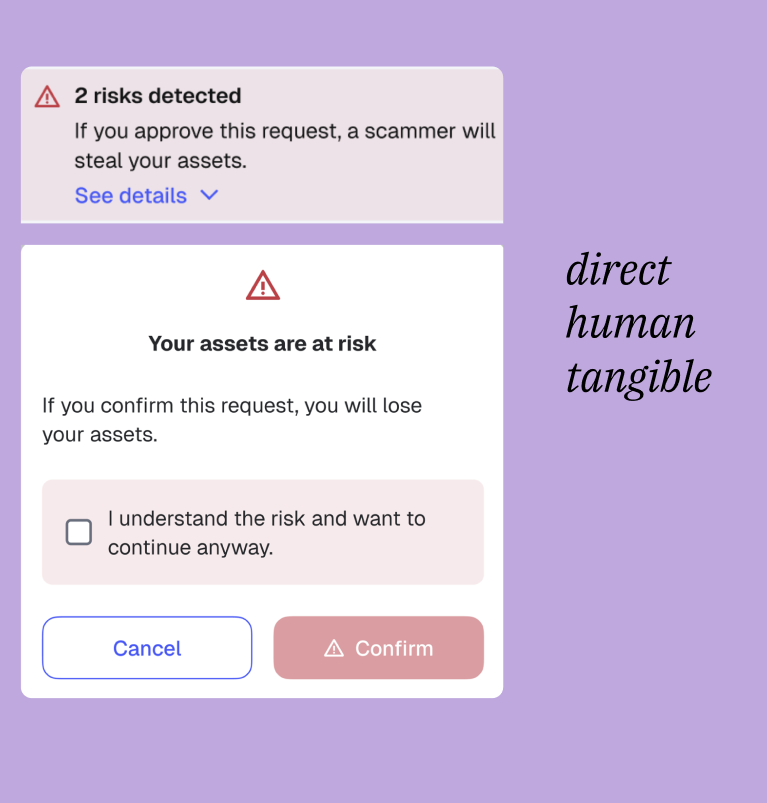
Create a “cognitive speed bump” that makes users actively consider what they’re about to do.
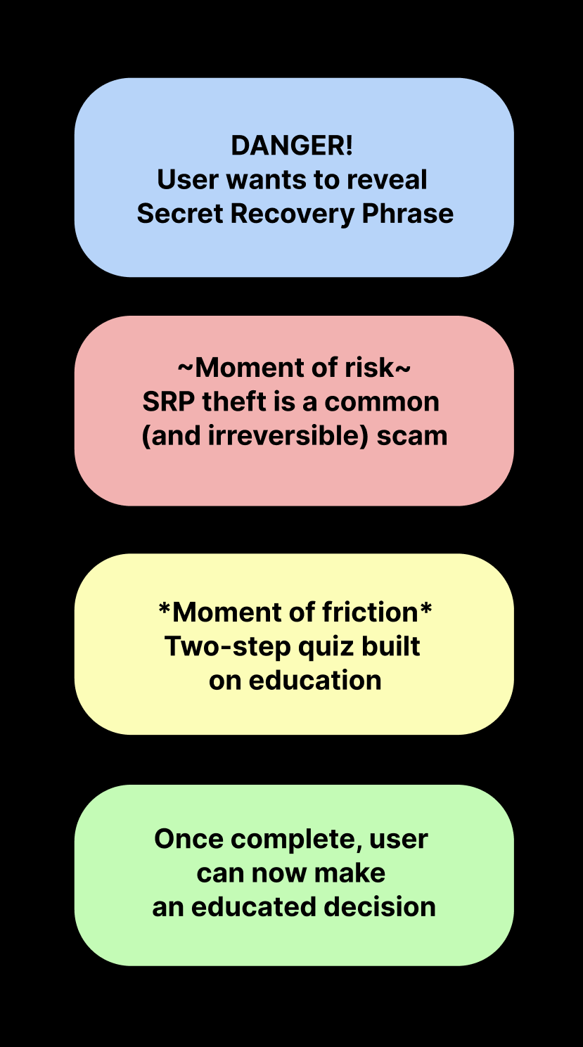
The quiz framework
I collaborated with my product design partner to build a two-question educational quiz users complete before accessing their SRP.
Purpose of the quiz:
Highlight the key risk: No one legitimate will ever ask for your SRP
Reinforce safe behavior and patterns
Create a cognitive pause before taking irreversible action
Increase scam recognition through simple, memorable language
Messaging strategy
Before
Set expectations: why this step exists and what’s at stake.
During
Teach one concept per question, using plain language and real scam examples.
After
Reinforce the most important lesson: No legitimate service will ever ask for your Secret Recovery Phrase.
Writing principles
Use plain language (speak human, not bot)
Reference real-world scam patterns (aka scammers are everywhere)
Reinforce correct behavior (never share your SRP, plz)
Avoid fear-mongering (but be real about the threats)
Embrace clarity + calm tone (take a deep breath)
Interaction principles
Minimal steps (less is more)
Clear feedback (y/n)
Low cognitive load (easy does it)
Direct connection to the task at hand (make it make sense)
Results
Impact
A significant portion of users chose not to reveal their Secret Recovery Phrase after completing the quiz.
(Specific numbers are confidential, but the change was material and meaningful.)
Security education at ecale
Prevented countless potential phishing attempts
Reduced SRP-related support tickets
Served as a model for other risk-related experiences
Behavioral shift
Users understood why SRP sharing is dangerous, even if they have the freedom to do so.
What this established
Content as security infrastructure
Strategic content placement can prevent real financial harm — as effectively as technical safeguards.
Empowerment over restriction
Users keep autonomy; we give them the context to make safe decisions.
Contextual learning
Education works when delivered at the exact moment of relevance.
Progressive disclosure
Start with essential concepts → offer deeper education only when needed.
“Education works better than barriers. When users understand why something is dangerous, they make better decisions.”
Designing safety at scale: Trust signals
Aka, how I built a system that standardized 60+ safety warnings, reduced legal review time, and helped millions of users navigate risk with clarity.
Context
MetaMask is the leading decentralized wallet with 30M+ monthly active users. People use it to buy, trade, stake, bridge, mint NFTs, interact with decentralized apps, and sign countless smart-contract requests.
Over 50% of these interactions come with meaningful security risk.
But until recently, our warnings around malicious or suspicious activity were:
inconsistent in tone
fragmented across surfaces
overly vague or overly severe
lacking clear next steps
This inconsistency caused two major problems:
Users ignored warnings because they didn’t trust them
Users felt paralyzed by alarmist messages that weren’t actionable
We needed a unified, strategic system, not a collection of one-off strings.
The problem
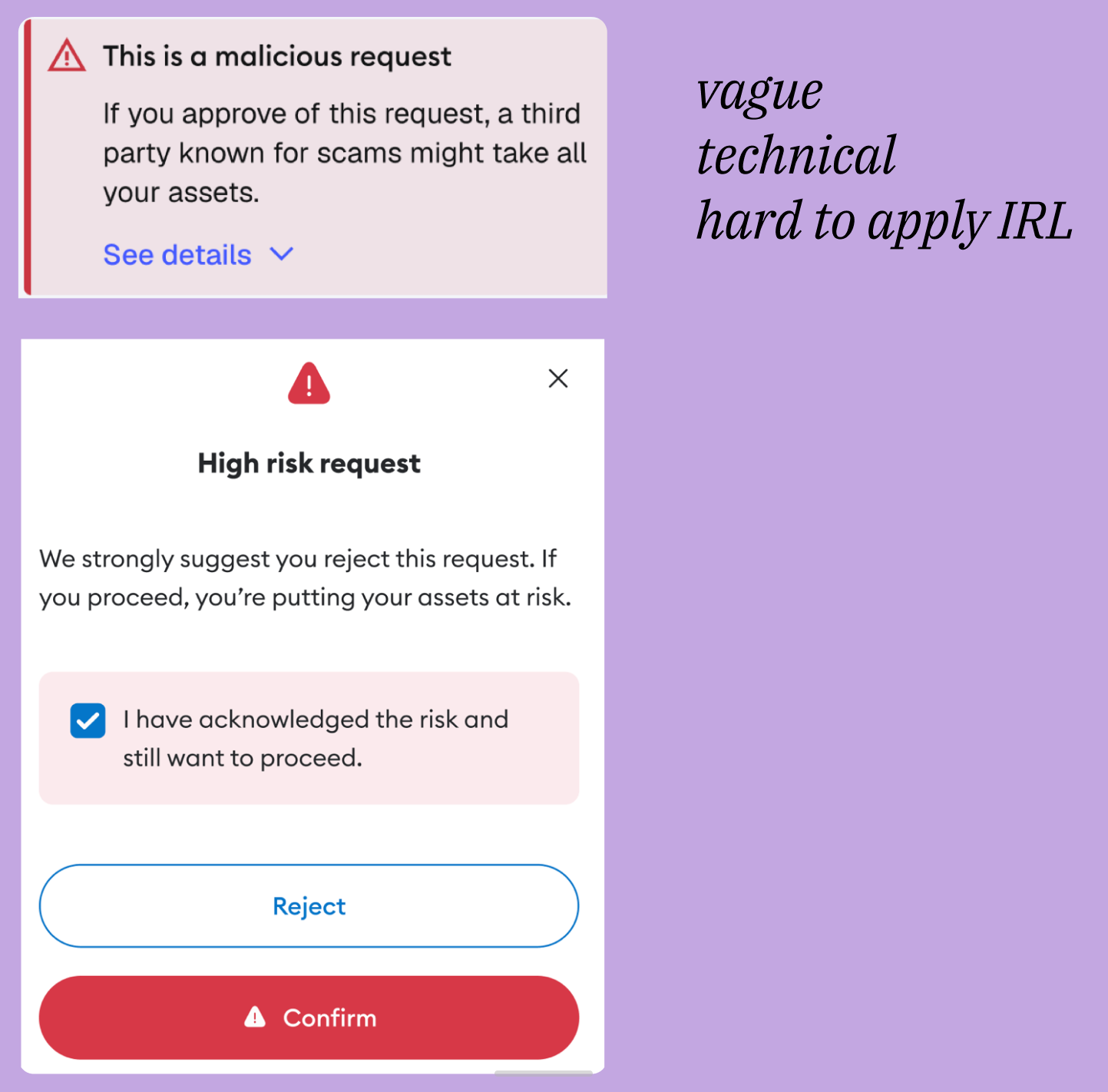
A lack of consistency in trust messaging made MetaMask feel unpredictable at the moments that mattered most.
Warnings that should have protected users instead:
created confusion
increased risky behavior
undermined credibility
led to real financial loss for users
This wasn’t a copy problem, it was a strategic systems problem.
Protection vs. fear
Designing trust interactions required answering high-stakes questions:
What’s the right level of friction?
Too little = users get scammed.
Too much = users abandon flows.
How should tone shift across threat levels?
The writing needed to feel calm, serious, and actionable, but never panicky.
How do we educate without overwhelming?
We had to communicate risk clearly while preserving user autonomy.
How do we maintain consistency with constantly evolving threats?
Scams mutate. Smart contracts vary. Context shifts. A static rulebook wouldn’t work, we needed a living system.
The “safe city” analogy
At the time, one of MetaMask’s principles was called “safe city,” as in we’re building a safe city, not a gated community.
This looks like:
We provide guardrails, guidance, and red flags
We don’t prevent users from going where they want
We educate them so they can make informed decisions
Trust is built through clarity and transparency, not force
This philosophy became the backbone of the framework.
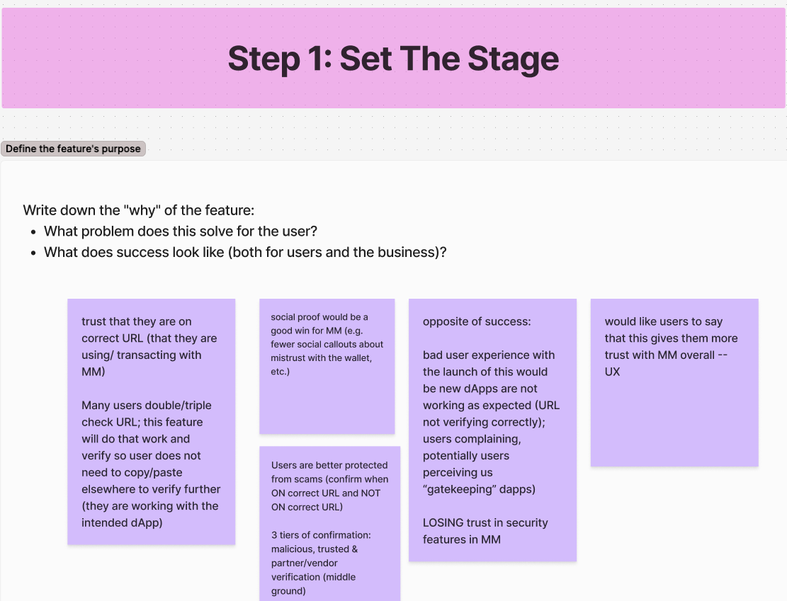
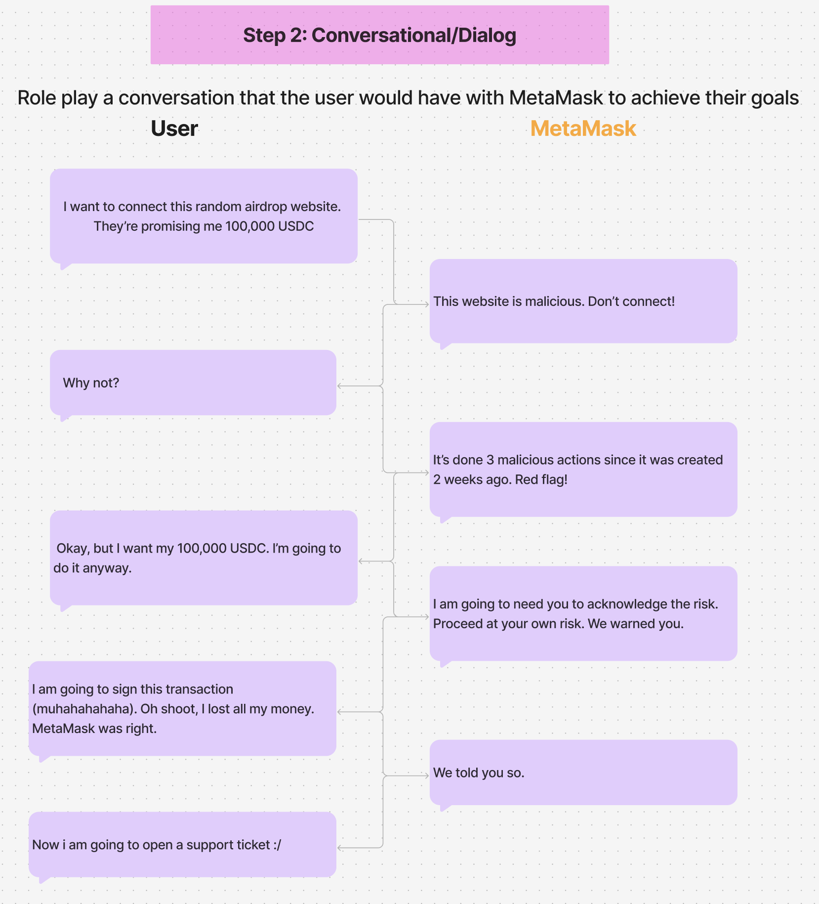
The process: Abstract → audit → empathize → build
I created a content-first workshop model we use when:
creating new features
simplifying complex user paths
research shows confusion
new threat patterns emerge
The workshop goals
Align on feature purpose
Identify user needs
Map risk points and necessary messages
Define behavioral outcomes
Create content before UI
What we did
I brought together PM, Design, Eng, Security, and Research to:
audit all legacy warnings
map where each warning appears
identify inconsistencies
uncover missing edge cases (like batched transactions)
rewrite messages collaboratively
This surfaced risks that engineering hadn’t fully accounted for, prompting PMs to rethink certain permissions and flows entirely.
The framework
I built a scalable Trust Signal Framework that defined:
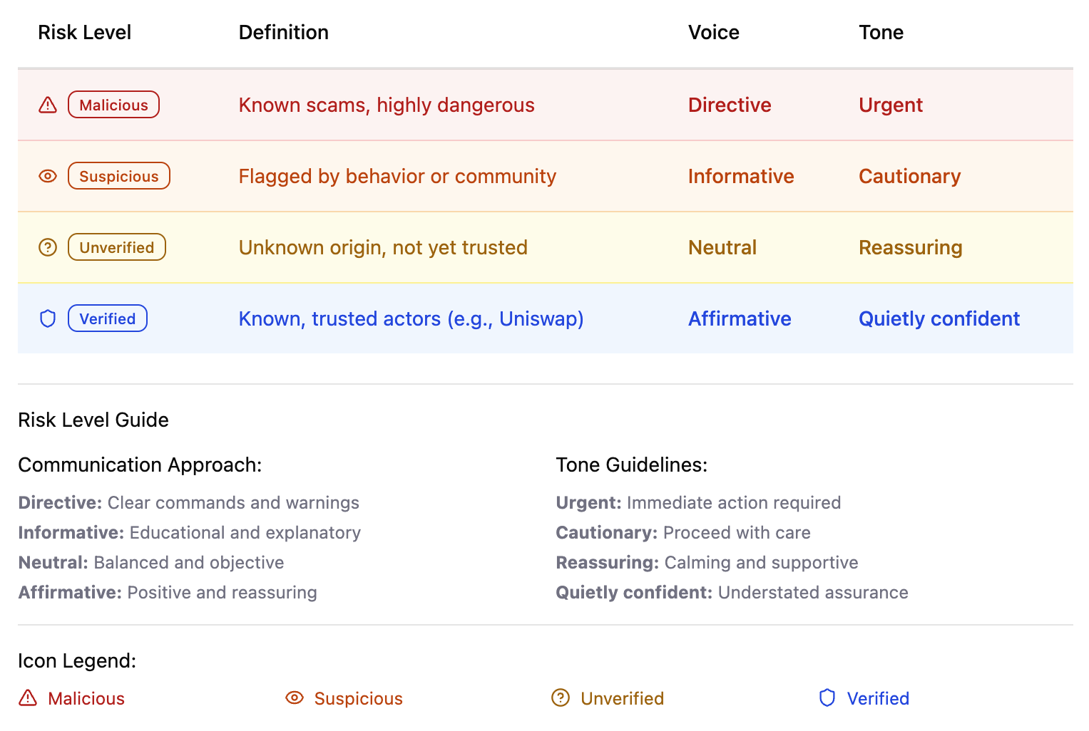
1. Four risk states
Malicious
Suspicious
Unverified
Verified
2. Tone rules for each
From urgent → calm, depending on severity
Never fear-based
Always actionable
3. CTA logic
Blocking, cautionary, or confirming
Clear next steps for users
Non-ambiguous decisions
4. Visual rules
Iconography
Color usage
Placement conventions
The framework turned subjective judgment into shared logic teams could apply independently.
Scaling through AI
As a small content design team, we couldn’t manually rewrite every warning across products.
So I used AI to help scale:
AI code crawler
Searched the codebase
Flagged inconsistent warnings
Identified duplicate strings
Surfaced outdated tone patterns
Training the UX Writing GPT
I trained our internal custom GPT on the final framework so it could:
Suggest the correct tone
Choose the right risk category
Recommend compliant CTAs
Reduce dependency on 1:1 reviews
This ensured the system lived beyond me and any single feature team.
Outcomes
✔️ Legal review time decreased by ~40%
✔️ 60+ warnings standardized
✔️ Faster product delivery and fewer escalations
✔️ Improved user understanding and trust
✔️ Teams could make decisions without bottlenecking content design
This shifted MetaMask from reactive, inconsistent messaging → to a coherent, trustworthy safety system.
Learnings
Trust is a system, not a sentence
Scaling safety requires shared logic, not one-off copy fixes.
Principal-level content design means codifying judgment
My job wasn’t writing every warning, it was giving teams the tools to write them correctly.
Education outperforms alarmism
Calm clarity protects users far better than fear.
Tools + systems = durable work
By integrating the framework into AI workflows and design tokens, the system became long-lasting.